

Brontë Café
The Brontë Café is a café connected to The American Writers Museum in Chicago, Illinois. The restaurant branding is based around Emily Brontë, the author of Wuthering Heights. The logo is a flower, bringing Emily's writing about nature to the brand, and the color palette inspired by her and her sisters, who were all authors.
This project includes:
- Logo and Color Palette
- Business System
- Menu
- Advertisments
- Branding Style Guide
- Collateral
Typography: Handlettered Brontë, Bodoni 72 & Helvetica Neue Bold.
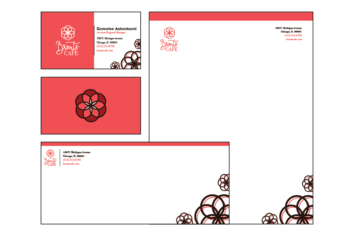
The Business System
The business system designed for Brontë Café features the pink, brown and cream color palette as well as the full logo in both one color and its full color form. The typography of which the contact information appears on all three remains consistently placed through out all three pieces, with the single color logomark also consistently appearing in the bottom right corner as a decorative flourish. The full color logomark appears on the back of the business card, which is also seen on a multitude of collateral throught the project. The red and cream stand out against the pink so beautifully to give it a memorable look.
The Menu
Like the business system, the menu for Brontë Café includes the full logo on the front and remains consistent with the use of the brand colors. This menu is a simple fold menu with a front and back insert placed in the inside. The menu features typical café food for museum goers to enjoy at the end of their tour, or a quick snack beforehand. This menu uses Helvetica Neue Bold as headers for each section and the pink color is used to highlight each food item. The insert design also includes the flourishes at the bottom right hand corner as seen in the business system.

The Branding Guide
The branding guide for Brontë Café is a full length brand guide used to showcase the company's mission, vision, and proper presence, voice, and use of the branding in various forms and advertisements. A few of those spreads are shown below. In this brand guide there are do's and don't's for use of the logo, the proper use of the logo and alternate logo, as well as the brand's color palette, typography and photography.

Collateral
Various collateral was designed for the Brontë Café that were all in relevance to the cafe look, feel, and image. For this project I designed a delivery van, coasters, coffee mugs and coffee bean bags, window and outdoor signage, employee t-shirts, an app, a billboard advertisment and an instagram advertisement. All collateral uses the same one color logo, in various forms, to showcase the Brontë Café brand.


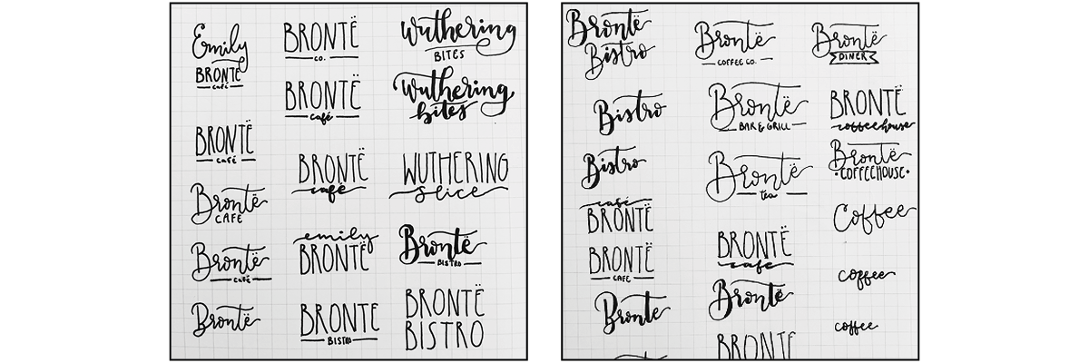
Sketches
These are two pages from my personal sketch book when I was working on the logotype for this branding project. I had several names that I liked, so I hand lettered each option before I decided which one was best suited for the demographic and paired museum. The final hand lettered "Brontë" actually came directly from these sketches.
Shelby Handley © 2020